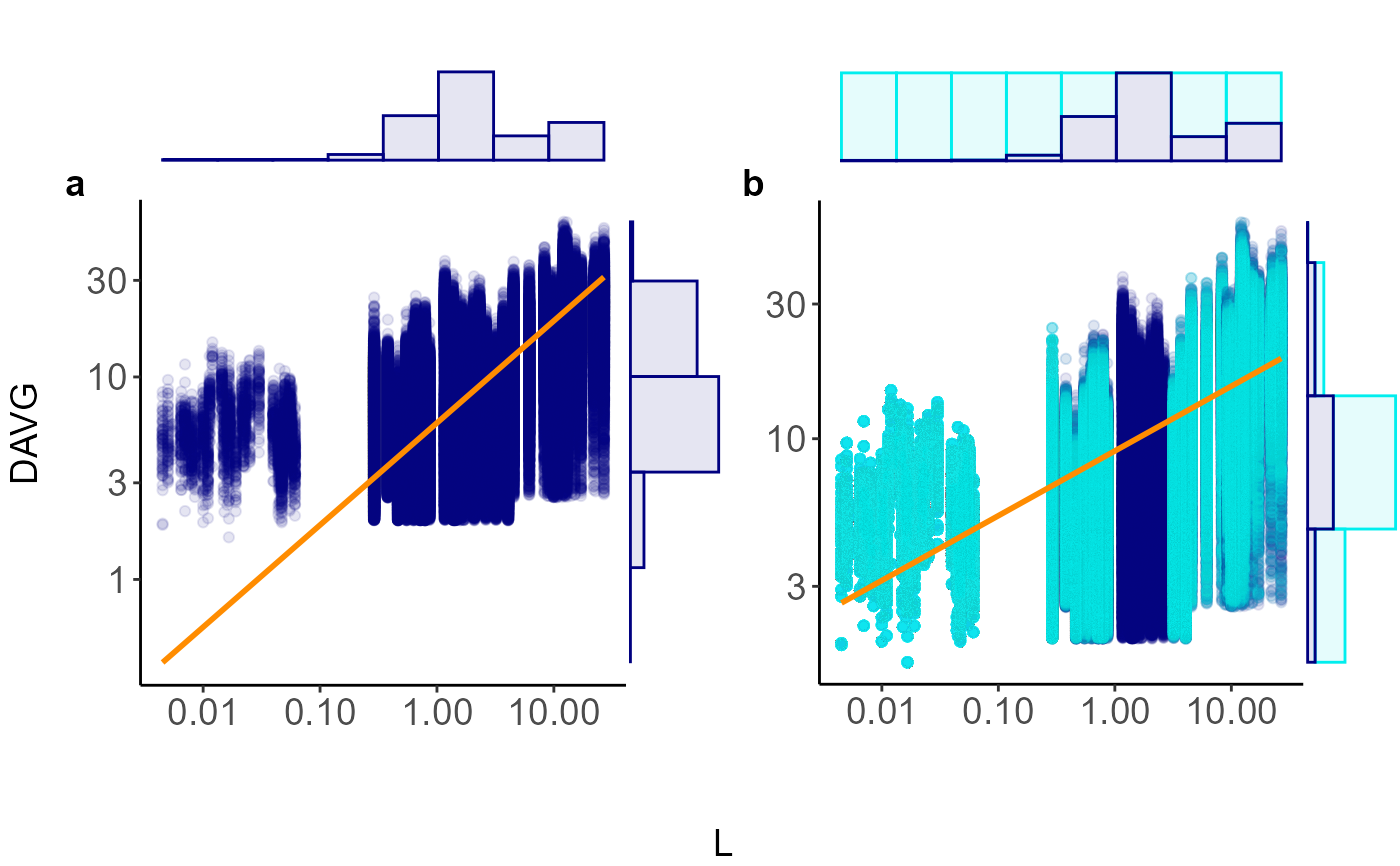
Visual comparison of original and balanced data using scatterplots and marginal histograms
Source:R/plot_balanced_scaling.R
plot_balanced_scaling.Rdplot_balanced_scaling() juxtaposes the raw data with the
bootstrap‑balanced sample returned by balanced_scaling().
Each panel shows a scatterplot overlaid with an SMA line and is wrapped
in marginal histograms that reveal how resampling fills sparse bins.
Arguments
- original_df
A data frame with the original observations.
- balanced_df
A data frame returned by
balanced_scaling(), which must contain a logical columnResampled.- var_x, var_y
Unquoted column names for the predictor and response.
- model_type
"power"(default),"exp", or"linear".- binwidth
Histogram bin width (on the binning scale). Can be called from bin summary (see "Examples").
- base
Logarithmic base when
scale = "log". Default10.- tag_letters
Two letters used to label the panels.
- x_lab, y_lab
Optional axis titles.
References
Simovic, M., & Michaletz, S.T. (2025). Harnessing the Full Power of Data to Characterise Biological Scaling Relationships. Global Ecology and Biogeography, 34(2). https://doi.org/10.1111/geb.70019
Author
Simovic, M. milos.simovic@botany.ubc.ca; Michaletz, S.T. sean.michaletz@ubc.ca
Examples
library(ggplot2)
#> Warning: package 'ggplot2' was built under R version 4.4.3

data(xylem_scaling_simulation_dataset)

res<- balanced_scaling(
  data        = xylem_scaling_simulation_dataset,
  var_x       = L,
  var_y       = DAVG,
  min_per_bin = 100,
  n_boot      = 10,
  seed        = 1,
  model_type  = "power"
)
plot_balanced_scaling(
  original_df = xylem_scaling_simulation_dataset,
  balanced_df = res$first_boot,
  var_x       = L,
  var_y       = DAVG,
  model_type  = "power",
  binwidth    = res$bins$summary$bin_width[1],
  base        = 10,
  tag_letters = c("a", "b"),
  x_lab       = NULL,
  y_lab       = NULL
)
#> Registered S3 methods overwritten by 'ggpp':
#>   method                  from
#>   heightDetails.titleGrob ggplot2
#>   widthDetails.titleGrob  ggplot2